
Approving Colour From a Screen: Why the Proof and the Mug Seldom Match
The Problem: Everyone Approves the Wrong Artefact
The approval conversation usually happens on a screen. The buyer opens a PDF, looks at a colour, and says yes. Weeks later the mugs arrive, and the colour reads differently — sometimes noticeably. Nobody did anything wrong; the problem is that a screen has never been able to show what a kiln will do to a glaze or an ink.
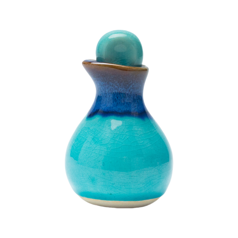
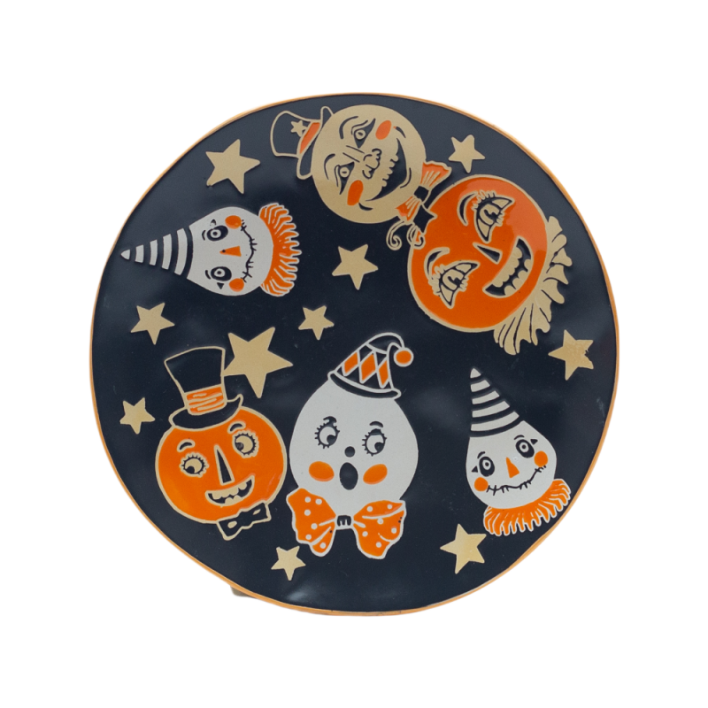
Products in this guide: Handmade Glazed Gourd-Shaped Spice Jar · Whimsical Halloween Ceramic Plates
Understanding why, and deciding what to approve instead, prevents the most common colour dispute in this trade.
Three Reasons the Screen Lies
Screens emit light; ceramic reflects it. A backlit screen shows a colour at a brightness no ceramic surface can reach. The same nominal colour will always appear flatter on a fired surface, and darker in a matt glaze than in a gloss.
Firing changes the colour. Decoration inks and glazes are not colour-fast to heat: most shift during firing, and a metallic or reactive glaze shifts more than a flat one. The factory works with fired results, not with the ink or glaze as supplied — which is why a colour approved from a file cannot be reproduced, only interpreted.
The same file renders differently everywhere. Monitor calibration, paper and lighting all vary. Two people looking at the same PDF on different devices can be looking at two different colours.
The Three Decisions That Fix It
1. Approve a physical reference, not a file. Ask for a fired colour swatch on the actual body and glaze — a tile or a fired sample in the target colour, sent to you. This is the only artefact that carries the information you are actually buying. Where the programme is large, request two or three candidate swatches rather than one, so you choose rather than accept.
2. Name the reference system, and its limit. A Pantone reference is a useful shorthand, but it is defined for printed paper, not for fired ceramic. Treat it as a direction, not a guarantee, and ask the factory to state what shift to expect on your body. For a brand-critical colour, ask for the closest match achievable in the chosen glaze and decide whether that is close enough.
3. Agree how the colour is judged, and under what light. Specify the light source for visual assessment (daylight or a defined lamp), the surface (gloss or matt) and the tolerance — a visual band against the approved swatch, or a measured difference for programmes that need a number. Then agree who holds the reference: a sealed, dated swatch retained by the factory.
Practical Sequence for an Order
- Brief: the colour, the body, the finish, and where the colour will be seen (retail shelf, café, gift box).
- Swatch: fired colour swatches on the real body and glaze — shipped, not photographed.
- Approve: one swatch, signed and dated; a second copy sealed and retained by the factory.
- First article: a decorated pre-production sample in the actual decoration, checked against the swatch under the agreed light.
- Production: batch colour records retained, so a later difference can be traced to a variable instead of argued.
This sequence costs a few samples and a week; it removes the single most common cause of rejected batches.
See <a href="https://www.storiwareceramicmugs.com/oid1757203/The-Custom-Mug-Programme-Buyer-Guides-by-Decision.htm">the custom mug programme guides</a> for the decisions that pair with colour — particularly batch consistency and finish choice. Our <a href="https://www.storiwareceramicmugs.com/products2147420/Custom-Ceramic-Mugs-Cups.htm">ceramic mugs and cups</a> range is quoted with a retained colour standard, and the <a href="https://www.storiwareceramicmugs.com/oid1756307/Custom-Ceramic-Mugs-Bulk-Order-Factory-Direct-from-China.htm">bulk order programme</a> sets out how sampling and production fit together. To set up a colour approval, <a href="/contact-us.htm">send the reference and the body</a>.
The spec freeze guide explains how artwork and packing files are locked between orders.
What to Put in the Order
- A fired colour swatch on the actual body and glaze, shipped physically.
- The reference system and its expected shift on your body.
- The judging method: light source, surface, tolerance band.
- A sealed, dated retained swatch held by the factory.
- A first-article check in the real decoration, before bulk.
- Batch colour records kept for the programme life.
The packaging guide explains how retail-ready and protective layers are specified together.
The Habit That Ties It Together
The habit is to approve something you can hold. Buyers who do this stop comparing a fired mug to a memory of a screen.
Related Products
Explore products featured in this guide:

Have questions? See our Sizes & Finishes FAQ and Ordering & Certifications FAQ.
Need a custom quote? Send an inquiry or browse our full product catalog.